
Is that really a donut up there in the attic?
So in an attempt to simplify their admittedly valuable "Here's What You Should Eat" public service message, the Administration developed a new graphic and theme that reminds me of a place setting I used when I was four:
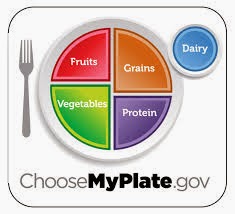
Based on this visual presentation, the website should be:
ChooseYoureNotGoingAnywhereUntilYouEatThis.gov
Now I'm not slamming plates, but aren't they things we always look down on? So see right there, we can't help but mentally tut-tut the non-pyramid design. The toddler plate reminds me that when I see food, I should stiffen, fold my arms and turn my head. So there's no way I could ever read this thing.
Let's take another stab at this project and design a learning tool using an icon that reflects our reverence for what we eat. I'm going to go ahead and work up something for Foodhenge to start with. Or maybe something man-made that can be seen from outer space, like the Great Wall of Food or pollution.
I'd like to see a Venn diagram with alcohol or chocolate as the shaded part that overlaps in a few meals or servings.
ReplyDelete